The new Panamera has been very much in the news lately, and the automotive media story line seems to typically be of the “ugly duckling to beautiful swan” sort. While I might not go that far, I will say that the original Panamera didn’t make it to my most beautiful Porsches list. Perhaps the worst angle for that car was the three-quarter rear, with the camera looking from one of the rear fenders toward the opposite side front. The word was that Wendelin Wiedeking, a very tall guy who was in the CEO driver’s seat at Porsche at the time, moved to the Panamera’s back seat long enough to be discomforted and call for a late design redo, resulting in the styling compromise that we saw in 2009.
I had the good fortune to do the new car introduction story and photos for Panorama that year. We wanted to make it look good, Porsche partisans that we are. Our cover was a dynamite twilight frontal reflection shot, and the opening spread was a partial overhead, both flattering. We did show that semi-
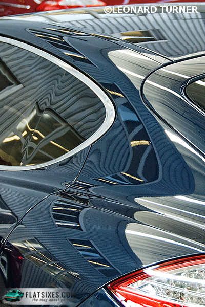
evil three-quarter rear—editorial integrity and all that—but I wasn’t happy about it. Which brings us to this week’s image, shot at another time in 2009, and in Weissach instead of Bavaria, where the car was originally introduced.

What we have here is a Panamera under a shed (but a very expensive shed; this is Weissach, after all!) The contours of the car pick up and variably distort the striations in the metal roof, with white and gold tones added by overhead lights and skylights. Touches of red are added by the taillight and an
unfocused background car. More of a fantasy than an illustrative shot, I’ve always rather liked it, although I don’t believe we ever used it in the magazine. And I don’t think it did any real harm to the
three-quarter rear view. What do you think?
